 So after about six months of a drum roll playing nonstop in my head, I finally got to see the cover for my book that’s coming out this August. For the first-time novelist, this is a bit like seeing a sonogram of your first-born — your first thought is, Yikes, it’s real! Your second is, Can I get a printout of that?
I also found the cover much more attractive than the sonograms of either of my children. Both of those kids looked like Doppler Radar weather maps.
I thought I’d write about this strange, graphical gestation period because (a) before it began I had no clue how the cover-creation process worked, and (b) even now I have no idea if my experience was typical.
Part one: In which the Author Searches for his Own Opinion
It started with Fleetwood Robbins, my editor at the time (who has since, to my great sadness, left Del Rey to go to Wizards of the Coast — may they suffer a thousand hit points of damage for luring him away), asking me, Did I have any ideas about the cover?
Now, I’ve been a tech writer, a marketing writer who used to publish corporate newsletters, and a web designer. I have ideas about what I like in design. But I’m fundamentally a text guy, and I know my limitations. Because I’ve been lucky to work with gifted graphic artists, I’ve learned that someone with an artist’s eye can come up with something I’d never have thought of, and render it beautifully. I did not want to muck with that.
Also, what did I know about what made a good cover? Like all readers, I liked some covers better than others. But why did I like them? And even if I figured out the whats and whys, would that help me know what would make a good cover for my book? I suspected not.
But Fleetwood asked. So I went to the book store and started squinting at shelves, and started keeping track of my favorites.
 I loved the covers on the Charlie Huston vampire novels — the bands of color, the strong typography, the cropped photographs (with fangs added). It looked cool, fun but literary. Plus, I preferred the papery feel of the covers, as opposed to something slick. |
 I also very much liked the cover for China Mieville’s Looking for Jake. I loved combination of a muted palette and a single, strong iconic image. I also very much liked the cover for China Mieville’s Looking for Jake. I loved combination of a muted palette and a single, strong iconic image. |
 That stenciled butterfly on Nick Sagan’s IdleWild caught my attention. I also realized that my cover could be greatly enhanced by changing my name to Sagan. That stenciled butterfly on Nick Sagan’s IdleWild caught my attention. I also realized that my cover could be greatly enhanced by changing my name to Sagan. |
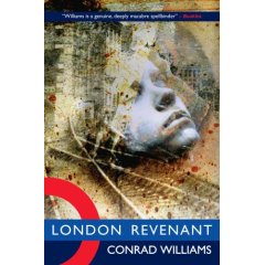 I liked this one too, for Conrad Williams’ London Revenant. The photo montage face struck me as a little too messy, but the cover was saved by the use of the London underground symbol, the strong banded colors at the bottom, and the clean typography. I liked this one too, for Conrad Williams’ London Revenant. The photo montage face struck me as a little too messy, but the cover was saved by the use of the London underground symbol, the strong banded colors at the bottom, and the clean typography. |
So from these examples and a few others I deduced a few of my own preferences. I liked muted palettes (mostly), a single iconic image over a montage (mostly), and papery covers over slick (again, mostly — but did I just like them because they seemed more “literary”? Did it make a difference?).
I sent off this “analysis” to Fleetwood. Now it makes me cringe. Thank goodness it had almost no effect on the cover.
Part Two: In which the Editor Explains what the Author’s Opinion Should Be
So how did we end up with the final product? As you may have suspected from the subheading, it was Fleetwood’s idea.
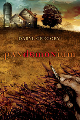
I’d suggested a couple images from the book — a slingshot, a boy lying in the water, a couple other things — and Fleetwood said, What about the farmhouse? In the novel there’s a recurring image of a farmhouse — literally a recurring image, in that farmhouse keeps showing up in a series of mysterious paintings and sculptures. Fleetwood wrote that “the tranquil pastoral scene juxtaposed with the title may be interesting.”
At first I was nonplussed. Would genre readers pick up a book with just a farm on the cover? How would we even signal that it was a genre book? The story’s about about demonic possession and Jungian archetypes, for goodness’ sake.
Then I started thinking a little more about it. Okay, I wrote to Fleetwood, it might be cool if the illustration at first looked pastoral, but something about the tone or mood suggested something more disturbing. And it also might be interesting if at first it looks like the cover is just a painting of a farm, but then there’s a hand or shadow or something that suggests this is a picture of a picture — we are seeing an artifact from the book as it’s being created.
Part Three: In which the Author Shuts Up and Lets the Artist Speak. A Little.
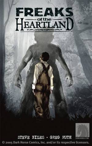 Finally it was time to bring in an artist. Greg Ruth (gregthings.com) is an illustrator and comic artist who’s recently worked with Kurt Busiek on his Conan the Barbarian series, and with Steve Niles on the beautiful Freaks of the Heartland. I hadn’t seen his work before, and didn’t even know his name until Del Rey sent me the cover, but I’m very happy they found him.
I e-mailed Greg and asked him if he could tell me how he got sucked into this project and what the process was like from his end. He graciously wrote back and said I could post his comments.
Greg writes:
Well I had met David Stephenson, the AD on this project last summer via my agent, Allen Spiegel. They had worked together in the past and Allen wanted us to meet with an eye towards working on something in the future. I have been doing a whole raft of covers for a bunch of different genres this last year, and was eager to see what we could do for this novel. David called me up with this project based mostly on what they liked about the first cover I did for a Dark Horse Comics series called “Freaks of the Heartland”. It featured an old hillltop farmhouse, menacing skies…. it was a perfect fit for what he wanted. SO the trick was to deliver something from that same source, but that would be utterly different as well. Often times I get the chance to read the manuscript, and pull an image for the cover from the text as I see it, other times the AD or the publisher already have an idea of what they want. This case fell into the second category, and while I typically prefer to find the cover in the book myself, we had precious little time before the solicitation catalogue, and so having a clear direction helped get us going. In a case like this, I tend to end up asking a good deal of questions to the AD to try and get the tone and feel of the book. Dave is great and had a lot to say, being a really accomplished illustrator and designer himself. Covers should sell and I think, enhance the book. They should reflect the story being told inside and I always find that if you look at the cover and it makes you want to know more, then read the book and look at the cover again and get more from it, that’s a success.
So. After a few quick pack and forth pencil sketches we settled on one and went to the final. I went straight to paints, making sure to keep the hand and brush portion as a separate layer, digitally, so David could move it about to accommodate the text. Sometimes a cover just pops right out perfect the first time, other instances it’s a long slow drag out of the cave- this one came on pretty solid out of the gate. Once the final was done there were only a few tweaks. It was a pretty smooth process. Fairly typical for a larger publisher with a committee system, and I look forward to doing more with Random House in the future.
Thanks, Greg.
David Stevenson, the Del Rey art director Greg mentioned, also solved the problem of how to signal that it was a genre book by suggesting that the the word “demon” be highlighted in red. And when the first draft of the cover came back it was Chris Schleup (the senior Del Rey editor who took me on when Fleetwood left) who suggested further tweaks, like toning down the red in “demon” to keep it more in the tonal range of the rest of the cover, and making the bottom of the picture degenerate into brush marks, as if it were a work in progress.
Epilogue: In which the Author Awaits the Opinion of the Market
So. A cover. I can’t wait to see what it looks like when it’s born. I mean, printed.
I’ll also have to wait to see how the book will sell. But if the numbers are poor I’m pretty confident it’ll be the fault of the book’s interior, not Greg’s cover.

Thanks for the look behind the curtain of the publishing world. Very interesting stuff. Good luck with the novel; I can’t wait to read it!
Ted! Thanks for stopping by, man.
And anyone else dropping by– check out Ted Kosmatka’s excellent story, “The Prophet of Flores,” appearing in at least a couple Years’ Best anthologies this summer.
–d
This process was WAY more involved than I expected. Though I have to admit that I never really thought about it much. It does raise a bunch of other publishing process questions though, like…
Do they release it to you or to reviewers before that date?
Do you get any complimentary copies, if so how many?
How many are they printing?
How much money have you set aside to buy up all of the copies for all of your local bookstores?
PT
Sorry for the typo, it should have read
How much money have you set aside to buy up all of the copies from all of your local bookstores?
PT
Many of these questions are mysteries to me too. I do know that on April 14 or so the Advanced Reader Copies (ARCs in the trade lingo), will go out to reviewers. They’ll have full-color covers, which is rare — evidently, Pandemonium is their “big” book for the fall, at least in the Trade Paperback niche.
As for complimentary copies, I should look and see if it’s spelled out in my contact. I have no idea. I also don’t know how many they’re printing — something that I should definitely ask about, if only because other writers like to know what the print runs are.
I should also find out how much it will cost to buy extra copies. I get a discount by buying from the publisher. However, if I forego the discount and buy from the local bookstore, then those would count toward my sales numbers when the publisher tries to figure out if I’m worth spending money on for another book.
But then what would I do with all those copies? I guess go to flea markets and set up shop in the back of my car. (I know a guy who wrote westerns who made some money by doing that.) Or else give them away as Christmas gifts for the rest of my life. Heh. How sad would that be?
Obviously, I need to do a little more homework.
It would only be sad if they re-gift you the copies back the next year!
PT